COMN
Brand identity, logo design, visual systems, guidelines, applications
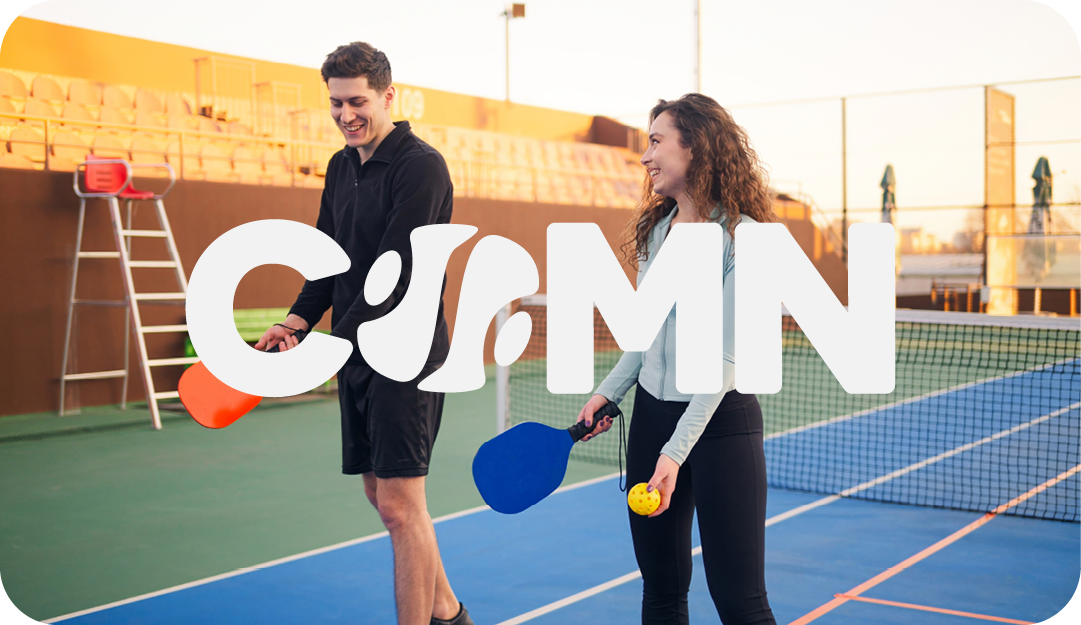
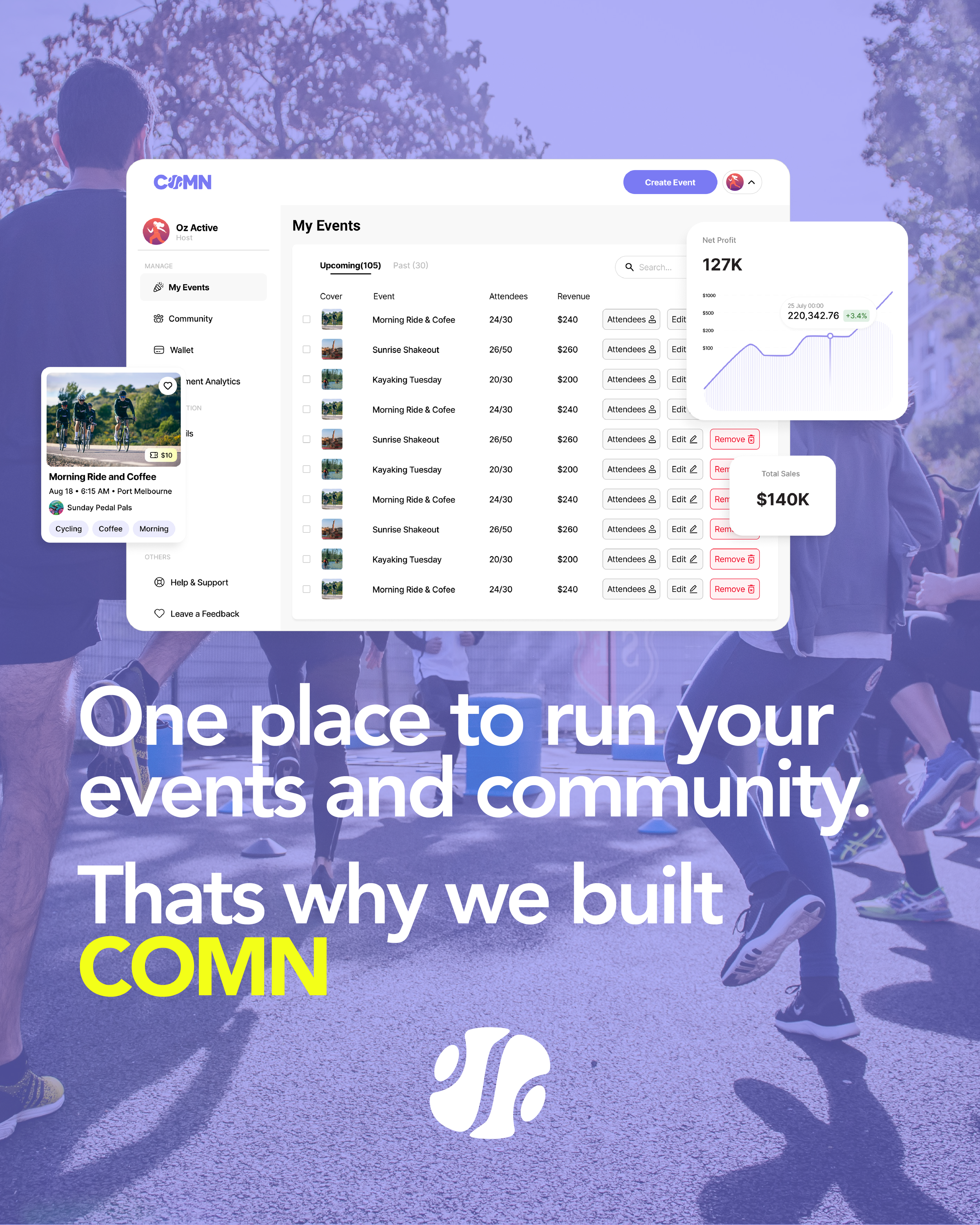
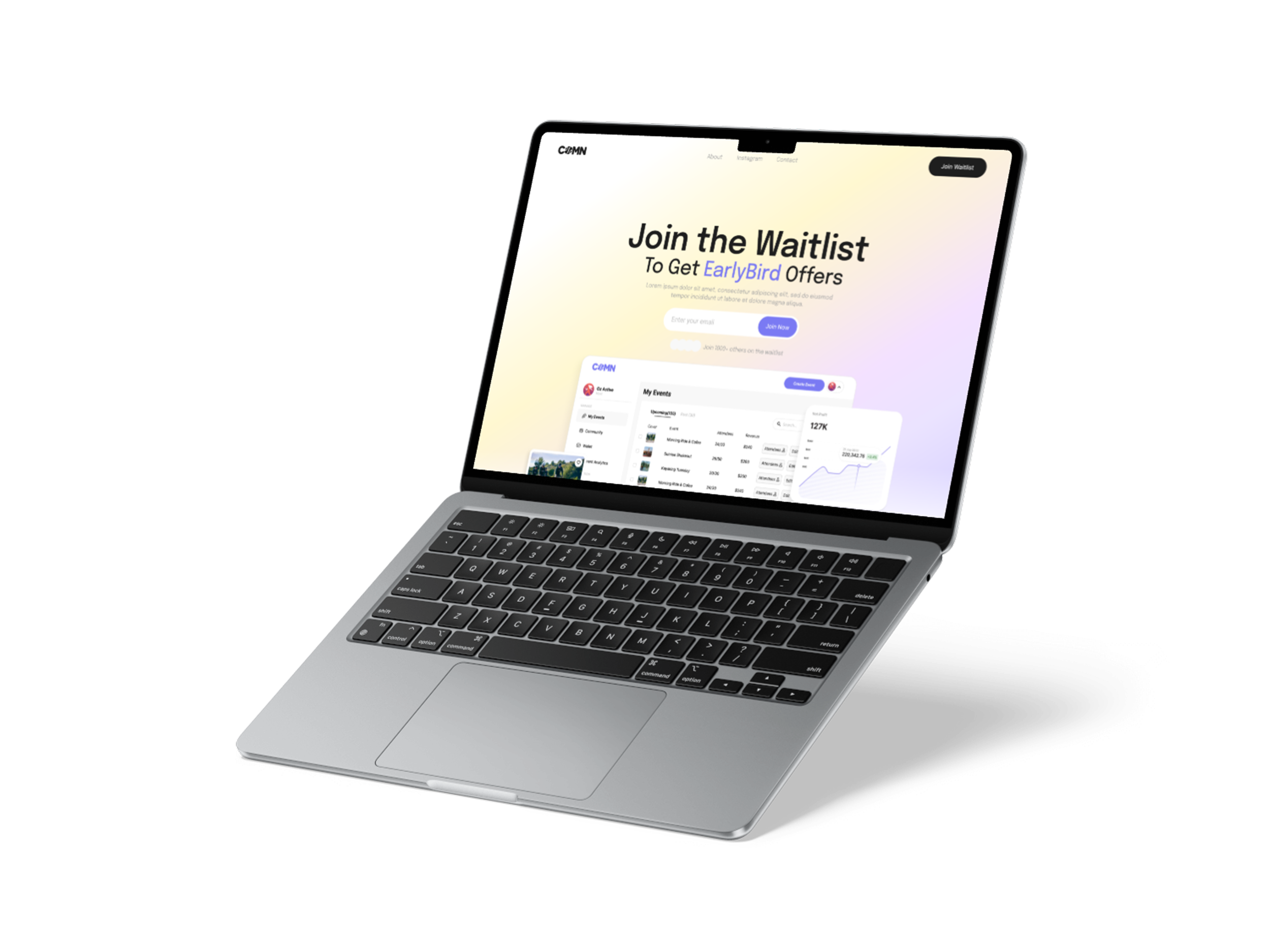
COMN is a brand identity project for a platform connecting people with local wellness communities and shared experiences. The brief required a visual system that felt warm, accessible and community-focused while remaining flexible across digital, print and merchandise applications.
The identity uses a clean typographic system, soft colour palette and simple graphic language to create a brand that feels approachable, contemporary and easy to apply across multiple touchpoints.